Mobile-First Design: What It Is and Why It Matters in 2025
Over 70% of global website traffic now comes from mobile devices — and this percentage continues to rise every year. Because of this major shift, Google now uses mobile-first indexing, which means your website’s mobile version is the primary basis for ranking, not the desktop version.
If your mobile design is slow, unreadable, or poorly optimized, your website will lose traffic, rankings, and potential customers. This guide breaks down mobile-first design in simple terms, perfect for beginners and business owners.
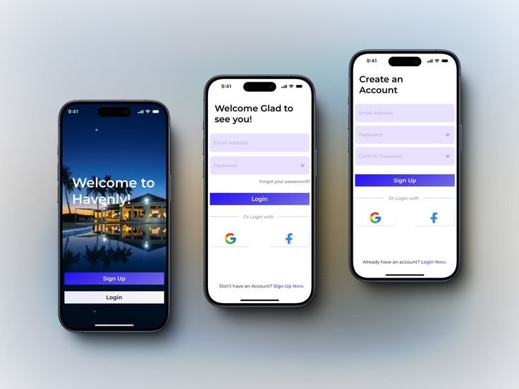
1. What Is Mobile-First Design?
Mobile-first design is an approach where designers and developers build the website starting with the smallest screen (mobile) before working upward to tablet and desktop.
The old way was desktop-first, shrinking everything down for mobile. But with most users browsing on mobile today, that method no longer works.
Mobile-first means:
- Designing for mobile screens first
- Keeping the layout clean and simple
- Adding more elements as the screen gets bigger
Think of it as building from the smallest foundation upward:
Mobile → Tablet → Desktop.
2. Why Mobile-First Matters in 2025
Mobile-first design impacts your:
✔ SEO (Search Engine Optimization)
Google ranks based on mobile performance. If your mobile site is slow or broken, your ranking drops.
✔ User Experience
Users leave within 3–5 seconds if the mobile version is difficult to use.
✔ Conversions & Sales
A smooth mobile experience leads to more inquiries, bookings, and customers.
✔ Brand Credibility
A clean, modern mobile site builds trust instantly.
3. How Mobile-First Improves SEO Automatically
1. Faster Load Times
Mobile-first encourages lightweight layouts, compressed files, and optimized images.
2. Cleaner Structure for Google Bots
Google can crawl and index mobile-structured sites more easily.
3. Better Core Web Vitals
- Lower CLS (layout shift)
- Faster LCP (largest content paint)
- Improved INP/FID (interaction delay)
4. Higher Engagement
Mobile users stay longer when the site is readable and easy to navigate — improving ranking signals.
4. Key Principles of Mobile-First Design
- Simplify the layout — remove clutter and keep content short.
- Use responsive typography — readable across all devices.
- Design for thumbs — place key buttons within reach.
- Optimize images — use WebP, correct sizes, and lazy loading.
- Use bigger buttons — at least 44px for comfortable tapping.
- Make navigation mobile-friendly — burger menus or collapsible sections.
5. Before vs After: Mobile-First Impact
❌ Desktop-First Website
- Looks fine on desktop but broken on mobile
- Small text, tiny buttons
- Images overflowing off-screen
- Hard to navigate
✔ Mobile-First Website
- Clean and readable
- Buttons easy to tap
- Images auto-resize properly
- Loads fast on all devices
- Higher conversions
6. Tools for Building Mobile-First Websites (2025)
Front-End Tools
- Tailwind CSS
- Bootstrap 5
- CSS Grid & Flexbox
- Responsive typography systems
- Vue 3 / Nuxt 3
- React / Next.js
Full-Stack Tools
- Laravel + Tailwind (excellent performance combo)
- Filament + TALL Stack
- Node.js (Express / NestJS)
Testing Tools
- Chrome DevTools (mobile device mode)
- Lighthouse
- PageSpeed Insights
- Responsively App
7. Is Your Website Mobile-First Ready?
Ask yourself:
- Is the site readable without zooming?
- Do images resize properly?
- Does it load under 3 seconds on mobile?
- Are buttons large and easy to tap?
- Is there zero horizontal scrolling?
- Is the layout simple and clean?
A “no” to any question means you need improvements.
Final Thoughts — Mobile-First Is Non-Negotiable in 2025
Mobile-first isn’t a design trend — it's an SEO requirement, user experience improvement, and conversion booster.
If you want higher rankings, better engagement, and more customers, mobile-first should always be the starting point of your website design.